D&D's New Dragon Redesigns
Wizards of the Coast have been announcing a LOT of changes to D&D as of late. Between the 5.5e (2024) rule changes and the looming shadow of One D&D, there's been quite a lot of negativity surrounding the announced changes, especially for One D&D. Not to mention the flack WotC has been receiving from careless MTG releases and from AI art slipping through the cracks in both D&D and MTG. But these dragon designs give me some hope that things won't be as bad as they seem in the future of D&D. (Or at least they won't be as bad in the 2024 handbook.)
First, let's get this out of the way: these are my opinions on the designs. They're definitely not for everyone, so you may not agree with my takes. However, I can say pretty confidently that the designs are much more unique than the classic D&D designs. They may not hit the same classic dragon itch, but they feel like a huge breath of fresh air when all the dragons (ESPECIALLY chromatic) used to look so same-y. I noticed a shift in D&D's dragon design when gem dragons were released in Fizban's Treasury of Dragons in 2021, and these new designs seem to follow through with the new design philosophies laid out in that book.
Gem Dragons
Okay, so I know you probably clicked for just the most recent redesigns, but I can't possibly be the only person who is obsessed with the gem dragons, right? They're so cool! Between gaining access to the more unusual elements (force damage dragons? yes please!) and their wonderfully unique designs, I could not get enough of these guys when Fizban released.
Gem dragons are not nearly as different as the newest designs, especially considering most have pretty standard-looking wings, but I think they're great to look at as a starting point for the more drastic design changes that came later. The artists and designers start to consider the habitats and personalities of the dragons and incorporate more of that into their designs.
Amethyst
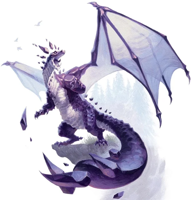
Look at 5e's amethyst dragon! It has such a unique silhouette between its low, stout stance and its massive club-like tail (which is especially noticeable from its side profile in the second photo). And did you know: they're amphibious! Their crocodilian and toad-like appearance is perfect for a dragon whose magic is all about water. (Well, water and explosive force.) Not much to say about this dragon aside from the simple fact that it's simply great.
Crystal
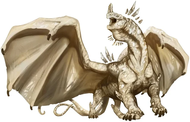
And now for the crystal dragon! It almost feels like a natural progression of the white dragon; both live in the same environment, the bulky stance is reminiscent of a polar bear, and their blunt claws would be perfect for running quickly over ice and snow or digging through those elements. I'm a big fan of its split tails, which remind me of the radiant psychic abilities its capable of using despite its brutish appearance. And the neck pouch! Its face! It's like a dinosaur got converted into a dragon! Even though I feel like it is one of the less unique gem designs, considering its similarities to the white dragon, it still stands out as something special and exciting, and there was clearly a lot of thought put into its design with regards to its habitat.
Emerald
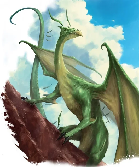
Behold, the emerald dragon! This one really breaks a lot of D&D's dragon stereotypes, being extremely long, lanky, and serpentine instead of being a massive, intimidating figure. It makes perfect sense too: emerald dragons are known to be curious, cunning, and conniving, so of course they're not getting into fights very often. And of course, the design language of serpents perfectly matches this sort of personality. It's very similar to the new green dragon design (I'll get to it eventually!), and considering the manipulative side of both of these dragons, I think it was a fantastic design choice. I love how these guys can look like little gremlins from the right angles.
Also, on another note about the emerald dragon: look at how leathery it looks! Technically emerald dragons are still scaled, as noted in their monster description, but it looks much more like snake scales/leather than it does traditional dragon scales. It adds a lot to the serpentine look and creates a much smoother silhouette, making it look so much more sneaky and slippery. I love it! (I also missed it while talking about the crystal dragon, but its scales are rather leathery in appearance too, almost like a Komodo dragon or a dinosaur! I really love the variety.)
Moonstone
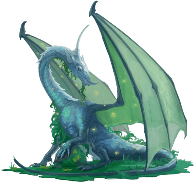
The moonstone dragon! Ok, I know it's not a gem dragon, but this guy was also released in Fizban's for the first time since 2e, so I felt I should include it. It was my favorite when Fizban's first released, and I was obsessed with the idea of making a wizard who would eventually True Polymorph himself into a moonstone dragon. And frankly, I still am. Maybe I'll include him in my next campaign. Anyways, about its design: finally, a dragon with a mane! It's a little controversial, but I absolutely love dragons with a bit of fur or fluff on them, and it helps an otherwise generic D&D dragon design look much more unique. (Calling the moonstone dragon generic admittedly feels criminal, but compared to some of the other gem dragons - and especially compared to the newer dragon designs - you can kind of see where I'm coming from.) I really appreciate the excessive use of that crescent moon shape, from the way the dragon's crest looks, to the way it rests its neck, to the curves of its fangs, it's really such a nice design element that adds so much to the moonstone dragon. And it's certainly a massive improvement from the unclear direction of the 2e moonstone dragon.
Sapphire
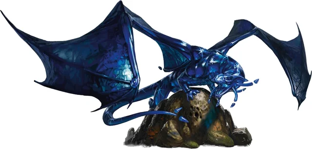
Enter, the sapphire dragon! I couldn't find any public concept art for this one, which is a real shame because it's one of, if not the most, unique of the gem dragons. As dragons who are militant, territorial, and ambush-loving, the official art positions the sapphire dragon in a crouched, big-cat-esque position. The smooth body is gorgeous and unlike any other dragon in 5e: it's like the scales are made of jello or glass! I'm not entirely sure if the lithe body would be my first design choice for a "war-like" dragon, but the smooth scales and the cat-like frame reminds me a lot of the official displacer beast art, which I suppose are quite violent and rather prone to attempting to ambush and murder parties.
Topaz
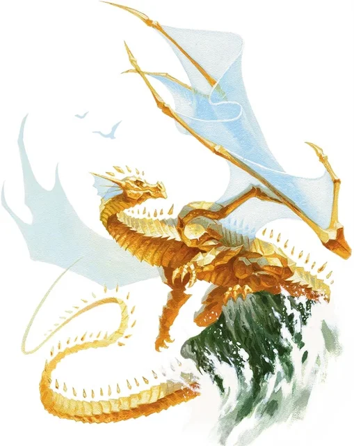
Last but not least on our list of Fizban's gem dragons: the topaz dragon! This design has definitely changed the least since its 3e days, but the few changes that were made are incredibly striking and unique. First of all: the backwards wings. Huge props to the artist for making them not look awkward and clunky, because it's a really neat idea! The symbolism of the backwards wings representing the topaz dragon's backwards lifestyle - one of decay, despair, and hunting squid despite hating water - was a very clever design choice. Plus, the translucent wings and frills offer a nice contrast against my favorite part of the design: the rigid, interlocking scales. You'd expect such a look to be common, or at least used before in 5e, but nope! It's present on other dragons' underbellies, like the old blue dragon, but the full-body look is entirely unique to the topaz dragon. It makes it look like a walking suit of golden, dragon-shaped armor.
You Forgot About the Space Dragons!!!
Okay, okay, before talking about the newest redesigns, I should probably talk about the lunar and solar dragons introduced in 2022's Spelljammer. I'll keep it brief because I don't really have much to say about them anyways.
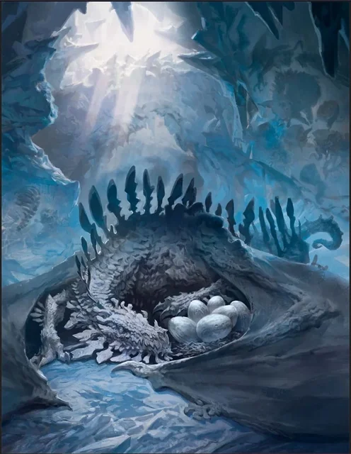
The lunar dragon is actually really generic, in my opinion. There's not really anything unique or notable about its design aside from its changing scale colors, which is neat, but isn't really reflected in its art. They're just dragons who live on the moon. Still cool, don't get me wrong, but they don't feel like anything special.
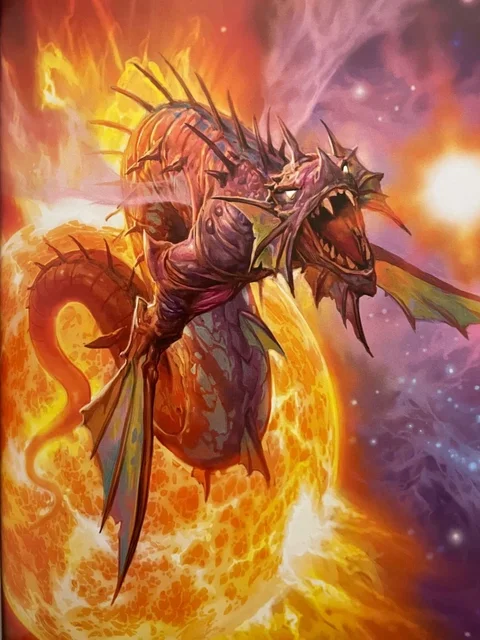
The solar dragon, on the other hand, is quite a bit more intriguing. I still don't enjoy it as much as I enjoyed the gem dragons, but it being more of a wyrm than a dragon is a fun decision to make, considering it doesn't really need limbs if it lives in space. My favorite thing about them is how they age: starting small, growing huge, then turning to an itty bitty hatchling size when they're ancient, just like real stars! I appreciate how their scale color changes to reflect that too. The solar flare wings are pretty badass too. Definitely my preferred design out of the two of them.
The New Classic Dragons
Finally! It's time to talk about the REAL controversial changes: the chromatic and metallic dragons. I personally adore most of the new designs that have been revealed, and I have very high hopes and expectations for the final two (white and brass) after seeing what they've done with the rest of these dragons.
In all honesty, I'm a bit surprised that WotC decided to redesign these classics. It feels like we've recently hit a D&D golden era between the success of so many podcasts, YouTube channels, Stranger Things, and the Honor Among Thieves movie, so it feels strange that they'd try to fix what isn't broke. Because if one thing is true, the original 5e designs are still wonderful and perfectly serviceable! I guess they wanted to make dragons feel less like "giant mass of fire damage" and more like the dragons described in Fizban's. Maybe these redesigns are their way of forcing DMs to more heavily consider the narrative weight of adding dragons to their settings? Who knows. All I know is that these redesigns are just as amazing as the originals, in their own different ways.
Chromatic Dragons
Black
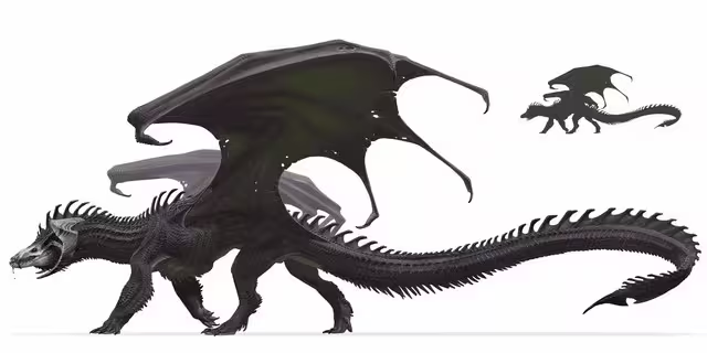
Guys. Gguys., I think I'm in love. IT HAS TOE BEANS! THEY GAVE THE BLACK DRAGON TOE BEANS!!
Okay, being more serious, I seriously love this redesign. It's very subtle - honestly, probably the most subtle of any of the redesigns - but it works so well. Black dragons already had a skull-like face, so obviously the next course of action was to give it the white scales to complete the look. Black dragons have always felt so situational and not as interesting as other chromatic dragons (at least to me; after all, how often is your party adventuring through the swamps?), but its new, more menacing mask is making it seem much more appealing to include in a campaign. Josh Herman did an excellent job at adapting the frill into smaller more segmented parts, creating the look of a twisted spine down the dragon's back. And it gets to keep its signature curved horns and hooked tail! This design was a huge win in my book because of how much scarier and menacing the black dragon now looks.
Blue
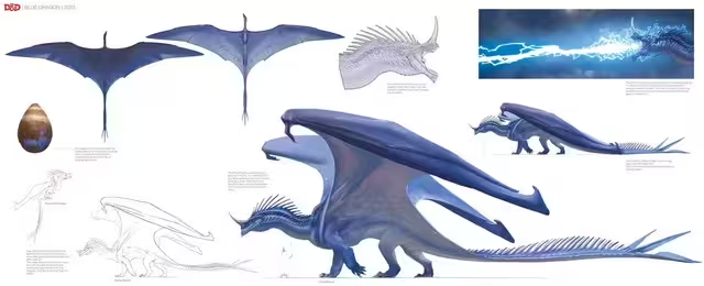
We were off to such a good start with the black dragon... and now... we're straight to the single most controversial redesign. Awesome.
I certainly have mixed feelings on this design. On one hand, they totally lean into the side of the blue dragon that is aerodynamic; blue dragons are skilled fliers who traverse entire deserts after all! And lightning belongs in the sky. That feels right.
But then when you consider this dragon is supposed to be "tyrant of the desert," it just really doesn't really look it. I think my biggest gripe is with the the smaller, slimmer spikes. A blue dragon's most notable feature is its massive nose spike, and while this design still does have a long spike, it just doesn't hit the same. And, it's missing that bright, contrasting yellow coloration! It's a lovely, graceful design, like desert birds of prey, but it's just not very threateningly commanding. And to me, that's not very blue dragon.
Anyways, back to the positives! Let's talk about the wings. I've always found the blue dragon's wings to be goofy and to look a little too small for its size, but these ginormous new wings are wonderful! I especially love how when the wings close, they're so massive that they appear almost cape-like, capturing that tyrant essence. And that unique flying silhouette? So powerful and majestic. I can also appreciate the glow coming from underneath the scales, like electricity is constantly flowing through it. I'd honestly love to see a version of the blue dragon that combines the spikes (and maybe some of the bulk) of the original and the better wings of the new.
Green
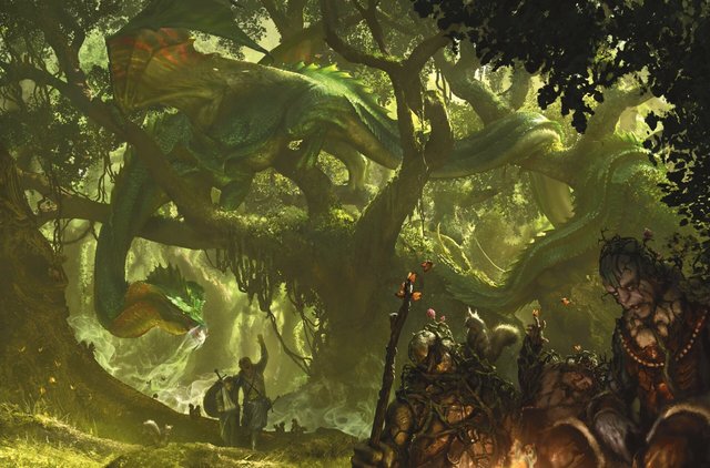
And now - back to a more positive note! This redesign is also extremely heavy, but I think it suits the green dragon wonderfully! Like the black dragon, I've always felt like the green dragon was in an awkward spot: it lives in the forest, which just isn't the kind of location I think of when I imagine a climatic dragon encounter, and it never seemed interesting enough to warrant choosing an unconventional battle arena just to fight one. (It's most notable design trait, aside from being green, was having no horns. Boring.)
But now, the green dragon has been totally revamped to match its personality! It's long, snake-like body is perfect to represent its manipulative and cunning nature, and I love its ability to slightly change the color of its frills when it feels threatened. It reminds me of something out of Jurassic Park! I really love its overhead silhouette as well; it feels like it wouldn't be very good at flying, but it would be excellent at traversing canopies, which really reinforces its whole stay-at-home lifestyle. With its new design, it now feels like traversing through a maze-like jungle to face down a conniving, trickster dragon who could ambush you at any moment from the treetops is much more exciting and believable than interacting with the previously brutish and bulky design.
Red
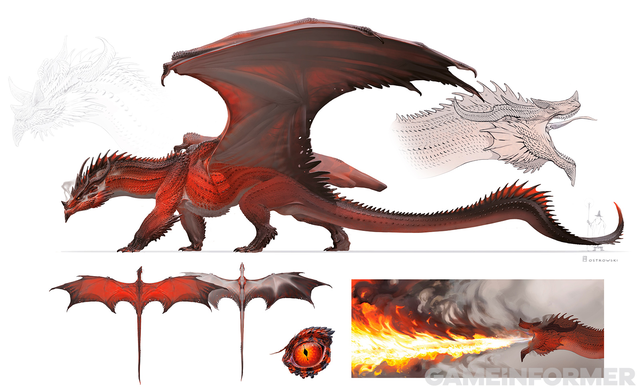
Finally, for the last dragon of our revealed chromatics, the red dragon takes a much less drastic change in design similar to the black dragon. This one makes sense: you cannot change the red dragon's identity too drastically without changing the entire identity of D&D! But like with the black dragon, I think the subtle changes here do a lot of heavy-lifting to really help characterize the red dragon.
Reds have always been characterize as the stereotypical burning-down-villages and eating-people-for-fun dragons, and the new design changes really lean into the evil aspects of that role! First of all, the dark, black scales of the dragon that have been added do the dual job of making a red dragon appear more natural in appearance while also taking advantage of color theory and emphasizing the twisted nature the dragon typically has. The hook in its horns and the small spikes added to its face give it a much more menacing and devilish look, again emphasizing its role as the big baddie of a campaign. I also really love the change to the underside of the red dragon's wings; a coloration like that would allow it to blend into smoke VERY easily, which there's probably a lot of if it lives in a volcanic area or is making the smoke itself (from the locally sourced burning villages of course). Imagine how terrifying it would be to suddenly get swooped down upon by a red dragon that you couldn't even see through the smoke! All in all, these are just minute changes that could've been assigned to a unique NPC in a campaign anyways, but they still feel good on the red dragon.
Tiamat
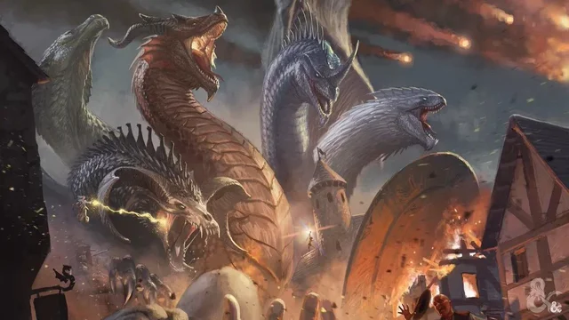
Tiamat also got a redesign since all of her heads got a makeover! I think being next to each other on Tiamat really highlights just how unique each and every new design is.
The biggest downside is that there's now three heads that look a bit like noodles; it used to just be the white head, but now the blue and green heads are joining it in the noodle zone. I think the white and green heads are fine, since they look like they belong on necks that long, but I really wish the blue head had just a little more spikiness to give the head a bit more shape. The blue head looks like a sea serpent, and while that's still cool, I'm not really sure that was the intention.
Metallic
Bronze
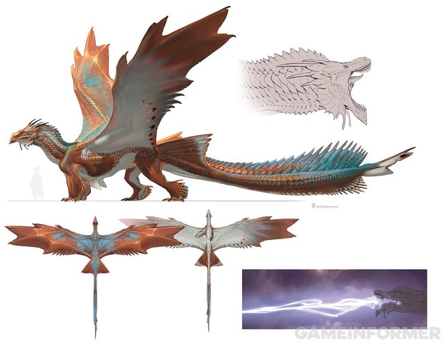
We're starting the metallic dragons off strong with the bronze redesign! I have to admit that bronze dragons losing their huge frills is a bit of a downer, but the beauty and uniqueness of the new redesign is well worth the sacrifice. I'll finally stop mistaking bronze dragons for brass dragons!
The best part of this design (aside from the scales finally being BRONZE) is definitely how cohesive it feels. The amphibious fins, the spinosaurus-esque tail, the countershading of the belly, it all just contributes to this design that screams amphibious deep-diver. It perfectly encapsulates their role as keepers of the coast, and I love just how easy it is to imagine this new version of the bronze dragon as a freedom-loving pirate, or perhaps as a long-distance flier over many seas (like an albatross!). It's probably my favorite of the metallic dragon redesigns for just how perfectly it works.
Copper
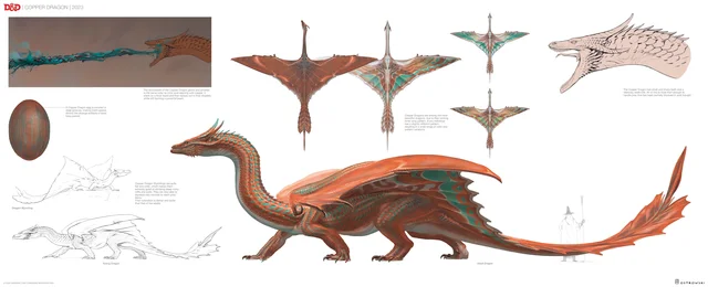
Copper dragons got a heavy redesign in a very similar vein to the green dragon. Personally, I'm a fan! But a lot of fans have been unhappy about the long neck.
But honestly? That long neck is the part of the design that I think really works towards emphasizing the typical copper dragon's character. The previous design had the copper dragon looking similarly regal to every other metallic dragon, but this new design allows the copper's more crafty and cunning side to come into full view. While not outright manipulative like green dragons are, copper dragons definitely fill the same niche as them when it comes to the metallic side of things. Both are curious, thoughtful, and conniving dragons, so both end up looking much more serpentine than the rest of their counterparts. I also love how the wing patterns were translated into a much more visually engaging look while still keeping the iconic copper gradients of the old design. As a whole the copper dragon just looks so much more playful and wily, and I love it for that.
Gold
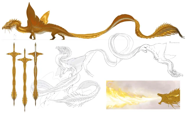
Just look at this majestic beast! Gold dragons got such a massive glowup from these redesigns. It's almost like a better, fully realized version of the solar dragon.
First, let's talk about the obvious eastern dragon inspirations. Gold dragons have always had a little bit of this from their long whiskers and wise yet aloof personalities, but the new design brings it to a next level. I'm instantly reminded of the dragons from Breath of the Wild emerging from massive bodies of water, accompanied by a tranquil yet awe-inspiring musical track. The long, noodley design communicates both their amphibious nature and the inspiration they draw from eastern dragons. Imagining a fateful duel between a gold dragon and a red dragon, the gold dragon twirling its body like a ribbon around the red as they fight midair, it just feels so right and so awesome.
Silver
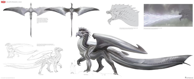
Last but not least, the final dragon for the entire post. Silver! The silver dragon honestly doesn't look all that different, aside from losing its beard, but what's definitely changed is its attitude.
Most other dragons' concept arts have them in a relatively neutral position, but the silver dragon is strutting its stuff. It's high CR and it knows it. The other official art of the redesign shows a silver dragon being praised by an entire city, likely the city it rules over. While silver dragons are merely written to love humanity in the Monster Manual, I'm definitely getting a bit of a politician vibe from this new redesign, and in my opinion, that lines up perfectly with most silver dragons in most campaigns! After all, what better way to help humanity than to offer them your awesome dragon powers and protection?
Unrelated to its newfound love of politics, but the silver dragon's wings have an incredibly intriguing shape. The majority of the other dragons whose wing shapes changed drastically all seemed pretty realistic, or at the very least inspired by real life animals. However, the silver dragon's new wings look like they've been actively clipped! Perhaps it's representative of how it'd rather spend its time on the ground among humanity than rule the skies with its brethren. Or maybe they just ran out of ideas to make unique overhead silhouettes.
(Also is it just me, or does the silver dragon kind of look like an airplane? I think it's the tail. Boeing 787 looking ass.)
Final Thoughts
I am incredibly excited to see the final two designs, and I seriously look forward to reading all the lore entries that will come alongside these new designs. I'm curious to know if they'll edit any of the statblocks too! The D&D design team seems really focused on giving monsters more personality than just big-scary-mass-of-damage-and-HP. And even though not every design is a hit for everyone, I am overjoyed with the overall results we got with the dragon redesigns. I'm stoked to see that the team is no longer focusing on just monster design, but rather, on character design. Every dragon has always been a distinct character, and I'm so glad to see how that's now reflected not only in lore, but in physical design too. I'm excited to see how they choose to characterize and differentiate the demons and devils next.
So... gem dragon redesigns when?
ttrpg